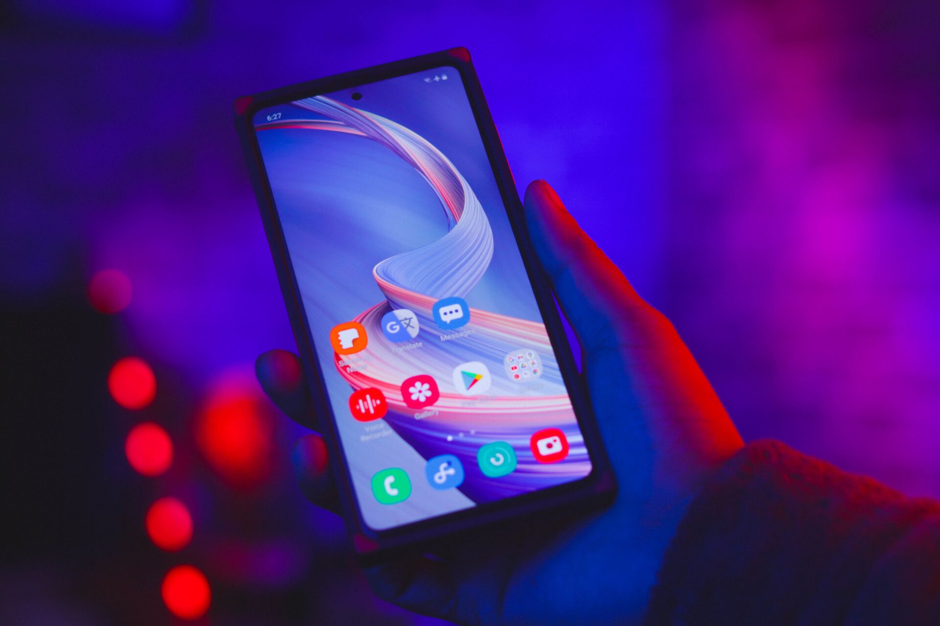
Why Mobile-Friendly Websites Matter for Your WordPress Site
In today’s digital age, where smartphones have become an extension of our lives, having a mobile-friendly website is no longer a luxury but a necessity. Think about it – how many times have you landed on a website on your phone, only to find it difficult to navigate, with tiny buttons and text so small that you need a magnifying glass to read it? Frustrating, right? Well, that’s exactly why mobile-friendly websites matter for your WordPress site.
First and foremost, a mobile-friendly website ensures a seamless and user-friendly experience for your visitors. People are constantly on the go, and they expect to be able to access information quickly and effortlessly, regardless of the device they’re using. By making your WordPress site mobile-friendly, you are catering to this demand and making it easier for users to navigate your site, find what they’re looking for, and ultimately engage with your content or products. This, in turn, can lead to increased conversions and a boost in your overall online presence. So, if you want to stay ahead of the game and provide the best possible experience for your audience, creating a mobile-friendly WordPress site should be at the top of your priority list.
- A mobile-friendly website ensures a seamless and user-friendly experience for visitors.
- People expect to be able to access information quickly and effortlessly, regardless of the device they’re using.
- Making your WordPress site mobile-friendly makes it easier for users to navigate your site.
- It helps users find what they’re looking for and ultimately engage with your content or products.
- A mobile-friendly site can lead to increased conversions and boost your overall online presence.
Understanding the Importance of Responsive Design for Your WordPress Site
Responsive design is a crucial element to consider when building your WordPress site. In our digital age, where people use a variety of devices to access the internet, it is essential to ensure your website looks and functions great on all screen sizes. Gone are the days when users would solely rely on desktop computers to browse the web. With the increasing use of smartphones and tablets, having a mobile-friendly website has become more important than ever before.
A responsive design allows your website to adapt seamlessly to different devices and screen resolutions. This means that whether a user is viewing your site on a desktop computer, a smartphone, or a tablet, the content and layout will automatically adjust to fit the screen size. By embracing responsive design, you are not only providing an optimal user experience but also increasing your chances of retaining visitors and converting them into customers. In a world where attention spans are shorter than ever, a site that is difficult to navigate or read on a mobile device may quickly lose your audience’s interest.
Choosing a Mobile-Friendly WordPress Theme for Your Site
When it comes to choosing a mobile-friendly WordPress theme for your site, there are a few key factors to consider. First and foremost, you want to ensure that the theme is responsive, meaning that it will automatically adjust and adapt to different screen sizes. This is crucial for providing a seamless and user-friendly experience for your mobile users. Additionally, you’ll want to look for a theme that is lightweight and optimized for speed. Mobile users expect quick loading times, and a slow website can lead to increased bounce rates.
Another important aspect to consider is the design and layout of the theme. A mobile-friendly theme should have a clean and simple design that is easy to navigate on a smaller screen. Avoid themes with excessive clutter or complex layouts that may confuse or overwhelm mobile users. Additionally, take a look at the theme’s customization options to ensure that you can easily personalize it to match your brand and style. Overall, selecting a mobile-friendly WordPress theme is a critical step in creating a successful and user-friendly website for mobile users.
Optimizing Images and Media for Mobile Devices on Your WordPress Site
When it comes to optimizing images and media for mobile devices on your WordPress site, there are a few key considerations to keep in mind. First and foremost, it’s important to resize your images appropriately for mobile viewing. Large, high-resolution images may look stunning on desktop screens, but they can significantly slow down the loading speed on mobile devices. Take the time to compress and resize your images to strike the right balance between image quality and file size.
Additionally, consider using lazy loading techniques for your media files. This means that images and videos are only loaded when they come into view, rather than all at once. Not only does this help improve loading times, but it also conserves data usage for users who may be on limited mobile data plans. By implementing these strategies, you can ensure that your WordPress site provides a seamless and enjoyable experience for mobile users, keeping them engaged and coming back for more.
Ensuring Fast Loading Speeds for Your Mobile-Friendly WordPress Site
When it comes to your mobile-friendly WordPress site, one of the key factors that can make or break the user experience is the loading speed. In today’s fast-paced digital world, users expect websites to load quickly and efficiently, especially on their mobile devices. Slow-loading websites not only frustrate users but also negatively impact your site’s search engine rankings. Therefore, it is crucial to ensure fast loading speeds for your mobile-friendly WordPress site.
To achieve a fast loading speed, there are several steps you can take. Firstly, optimize your images and media files for mobile devices. Large and uncompressed images can significantly slow down your site’s loading time. Make sure to compress your images and choose the appropriate file formats, such as JPEG or PNG, to reduce their file sizes without compromising the quality. Additionally, consider lazy loading techniques, which load images as the user scrolls down the page, rather than all at once. By implementing these strategies, you can greatly enhance the loading speed of your mobile-friendly WordPress site.
Furthermore, it is essential to prioritize simplicity when it comes to the design and functionality of your site. Avoid cluttered layouts, excessive animations, and unnecessary scripts that can weigh down your site and increase loading times. Keep your site’s navigation streamlined and intuitive, allowing users to effortlessly find what they are looking for. By simplifying the user experience, you not only improve loading speeds but also create a more user-friendly environment, leading to increased engagement and conversions on your mobile-friendly WordPress site.
Simplifying Navigation and User Experience for Mobile Users on Your WordPress Site
When it comes to mobile users, simplicity is key. Navigating a website on a small screen can be frustrating, so it’s important to ensure that your WordPress site is easy to use and understand. One way to simplify navigation is to have a clear and concise menu structure. Avoid cluttering your menu with too many options – stick to the essentials and make it easy for users to find what they’re looking for. Additionally, consider implementing a hamburger menu, which is a popular choice for mobile sites. This allows users to access the menu with a single tap, keeping the screen clean and uncluttered.
In addition to simplifying navigation, it’s crucial to prioritize the user experience on mobile devices. Mobile users have limited screen space, so it’s important to optimize your site’s layout for smaller screens. Avoid using large images or excessive amounts of text that can make the page feel overcrowded. Instead, focus on creating a clean and visually appealing design that is easy to navigate. Consider using a responsive theme that automatically adjusts the layout based on the screen size, ensuring a seamless experience for all users. By simplifying navigation and enhancing the user experience, you can make your WordPress site more appealing and user-friendly for mobile users.
Implementing Mobile-Friendly Plugins to Enhance Your WordPress Site
Mobile-Friendly Plugins can significantly enhance the functionality and user experience of your WordPress site on mobile devices. These plugins are specifically designed to optimize your site’s performance, making it more responsive and user-friendly. One popular plugin is WP Mobile Menu, which allows you to create a sleek and customizable mobile menu for your site. With its intuitive interface, you can easily choose from different menu styles, icons, and animation effects to make it visually appealing and user-friendly. Furthermore, this plugin ensures that your mobile menu looks great on any device, regardless of screen size or orientation.
Another useful plugin is WP Touch, which automatically transforms your website into a mobile-friendly version with a clean and elegant design. It offers a range of customization options, allowing you to control the appearance and layout of your mobile site. WP Touch also comes with built-in support for mobile advertising, making it easy for you to monetize your mobile traffic. By implementing these mobile-friendly plugins, you can significantly improve the mobile browsing experience for your site visitors, making it easier for them to navigate, engage with your content, and ultimately, increase conversions.
Testing and Analyzing Your WordPress Site’s Mobile-Friendliness
To ensure that your WordPress site is mobile-friendly, it is crucial to test and analyze its performance on various devices. Testing allows you to understand how well your site adapts to different screen sizes and resolutions, ensuring that users can easily navigate and access your content on their mobile devices. A responsive design is essential to provide a seamless user experience, as it guarantees that your site looks and functions flawlessly across smartphones, tablets, and other handheld devices. By testing your site on a range of devices, you can identify any potential issues or inconsistencies and make the necessary adjustments for optimal mobile performance.
Analyzing your site’s mobile-friendliness goes beyond simply checking if it looks good on different devices. It involves examining the speed at which pages load on mobile, as slow loading times can frustrate users and lead to higher bounce rates. Additionally, you need to ensure that the navigation and user experience are intuitive and user-friendly on mobile screens. By analyzing user behavior, you can gain valuable insights into how visitors interact with your site on mobile devices, allowing you to make data-driven decisions to improve their experience. Testing and analyzing your WordPress site’s mobile-friendliness is an ongoing process that should be regularly performed to guarantee a positive mobile experience for your audience.
Optimizing Your WordPress Site for Mobile Search Engine Optimization (SEO)
Mobile search engine optimization (SEO) plays a vital role in ensuring the visibility and success of your WordPress site on mobile devices. As more and more people rely on their smartphones and tablets to browse the internet, it is crucial that your website is optimized for mobile search. One of the key aspects of optimizing your WordPress site for mobile SEO is to focus on user experience. Mobile users have different needs and expectations compared to desktop users, so it is essential to tailor your site’s design and content to provide a seamless and enjoyable mobile browsing experience.
To optimize your WordPress site for mobile SEO, start by ensuring that your site is mobile-friendly and responsive. This means that your site should automatically adjust its layout and content to fit various screen sizes and resolutions, providing a smooth browsing experience across different mobile devices. Additionally, make sure to optimize your site’s loading speed for mobile users. Slow-loading websites not only frustrate users but also negatively impact your SEO ranking. Compressing images and minimizing the use of heavy media files can help improve your site’s loading speed on mobile devices. By prioritizing user experience and optimizing your site for mobile SEO, you can enhance your site’s visibility and attract more organic traffic from mobile users.
Best Practices to Maintain a Mobile-Friendly WordPress Site
With the increasing number of mobile users accessing websites, it has become essential to maintain a mobile-friendly WordPress site. Here are a few best practices to ensure that your site is easily accessible and user-friendly on mobile devices.
First, make sure to regularly update your WordPress version and plugins. This will not only keep your site secure but also ensure that any new features and improvements for mobile optimization are implemented. Additionally, regularly checking for any compatibility issues with your chosen theme and plugins will help in maintaining a smooth mobile user experience.
Another important practice is to simplify your site’s navigation and design. Mobile users typically have a smaller screen size, so it’s crucial to prioritize simplicity and reduce the amount of clutter on your site. Consider using dropdown menus, collapsible sections, and clear call-to-action buttons to enhance the user experience. Also, ensure that your font sizes are easily readable on smaller screens, and optimize your images and media files for faster loading times.
By following these best practices, you can maintain a mobile-friendly WordPress site that provides an excellent user experience, increases engagement, and ultimately drives more traffic to your website.
Why is it important to have a mobile-friendly WordPress site?
Having a mobile-friendly WordPress site is crucial because the majority of internet users now access websites through their mobile devices. If your site is not mobile-friendly, it can lead to a poor user experience and potential loss of visitors.
What is responsive design and why is it important for my WordPress site?
Responsive design is an approach to web design that ensures your site looks and functions well on all devices and screen sizes. It automatically adjusts the layout and content based on the user’s device. Responsive design is important because it provides a consistent and user-friendly experience across different devices.
How do I choose a mobile-friendly WordPress theme?
When choosing a mobile-friendly WordPress theme, look for themes that specifically mention they are responsive or optimized for mobile devices. Additionally, consider themes that have a clean and simple design, as cluttered layouts can be difficult to navigate on mobile.
How can I optimize images and media for mobile devices on my WordPress site?
To optimize images and media for mobile devices, you can compress them to reduce file size without compromising quality. You can also use lazy loading, which loads images and media only when they are visible on the user’s screen, improving loading speeds.
How can I ensure fast loading speeds for my mobile-friendly WordPress site?
To ensure fast loading speeds, optimize your site’s code, minimize the use of plugins, and utilize caching plugins. Additionally, consider using a content delivery network (CDN) to distribute your site’s content closer to your users.
How can I simplify navigation and user experience for mobile users on my WordPress site?
Simplify navigation by using a clear and concise menu structure, ensuring buttons and links are large enough to tap easily, and providing breadcrumb navigation. Additionally, optimize your site’s forms for mobile by using mobile-friendly input fields and reducing the number of required fields.
Are there any mobile-friendly plugins I can use to enhance my WordPress site?
Yes, there are many mobile-friendly plugins available for WordPress. Some popular ones include WPtouch, Jetpack, and WP Mobile Menu. These plugins can help optimize your site for mobile, improve performance, and enhance user experience.
How do I test and analyze my WordPress site’s mobile-friendliness?
You can test your WordPress site’s mobile-friendliness using tools like Google’s Mobile-Friendly Test or GTmetrix. These tools analyze your site’s performance on mobile devices and provide insights on areas for improvement.
How can I optimize my WordPress site for mobile search engine optimization (SEO)?
To optimize your site for mobile SEO, make sure your site is responsive, use mobile-friendly keywords, optimize meta tags and descriptions, and improve page loading speed. Additionally, consider utilizing Google’s AMP (Accelerated Mobile Pages) to further enhance mobile SEO.
What are some best practices to maintain a mobile-friendly WordPress site?
Some best practices include regularly updating your WordPress version and plugins, monitoring your site’s loading speeds, regularly checking your site’s mobile-friendliness, and keeping your site’s content organized and easy to navigate. Additionally, regularly backing up your site’s data is essential to ensure quick recovery in case of any issues.